Orchestrating Identity
Identity Verification Brand
Created at branding by garden
Identification and verification can often feel opaque and overly technical. While at Branding By garden, I worked on brand exploration, art direction, and the development of brand guidelines for a company in this space.
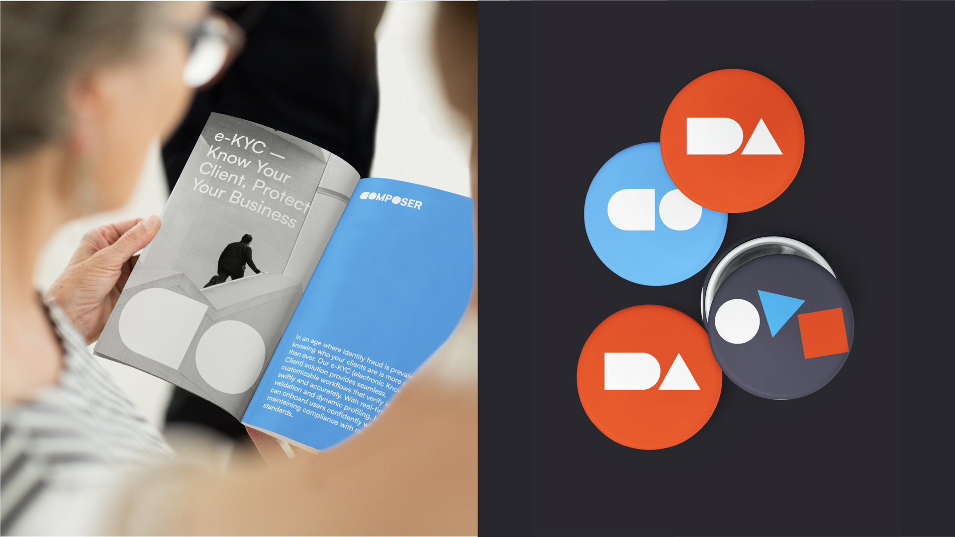
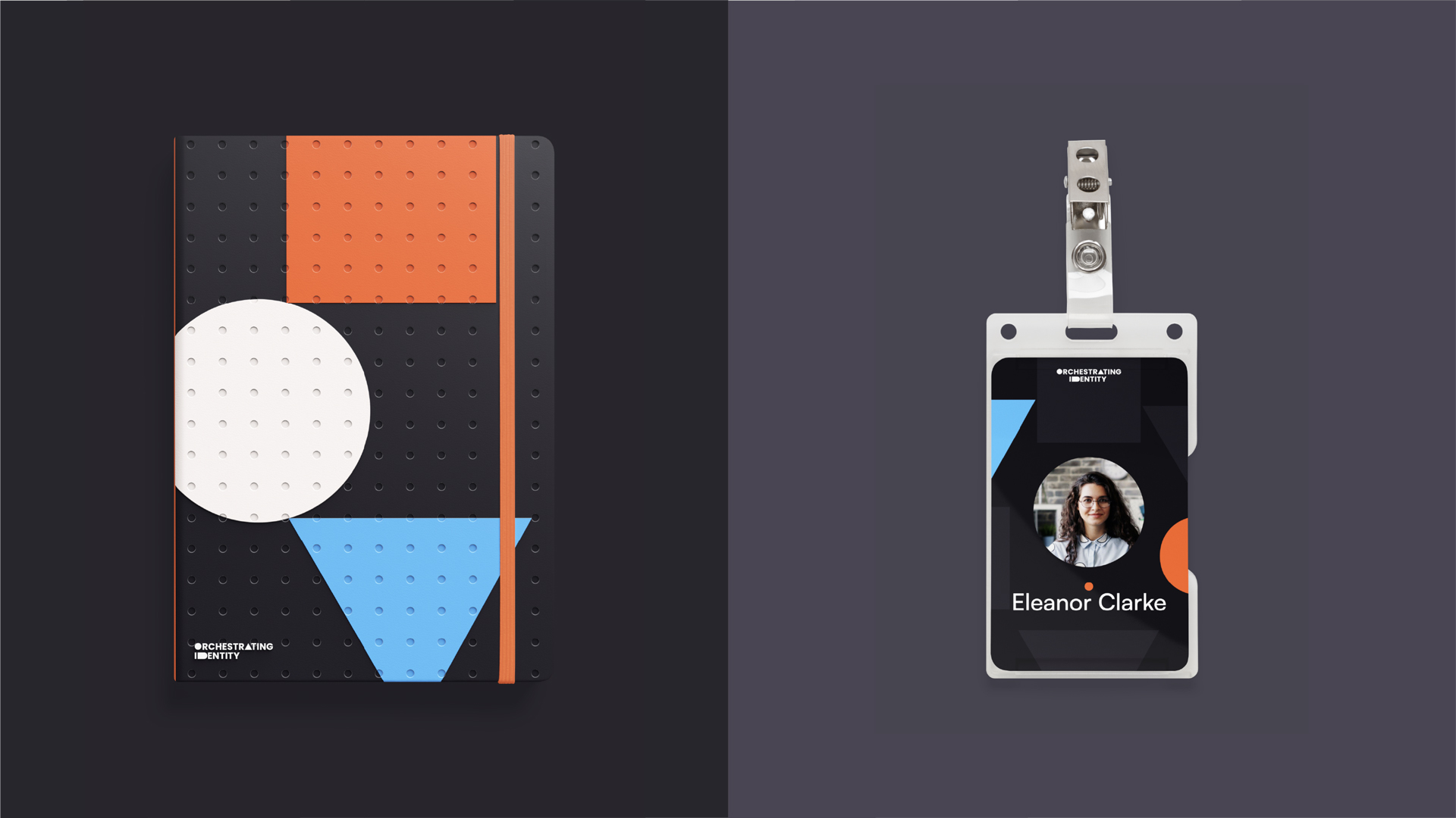
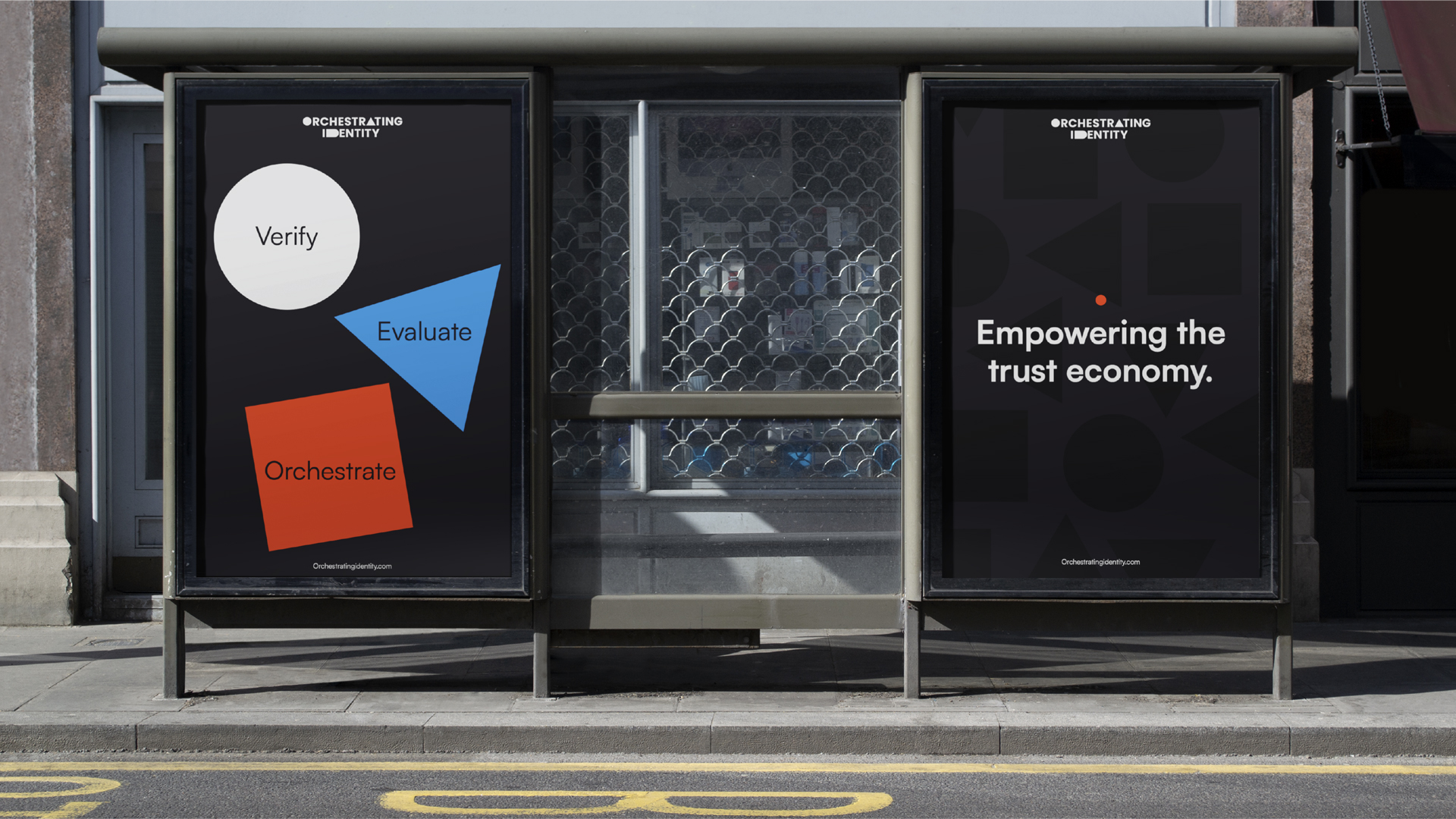
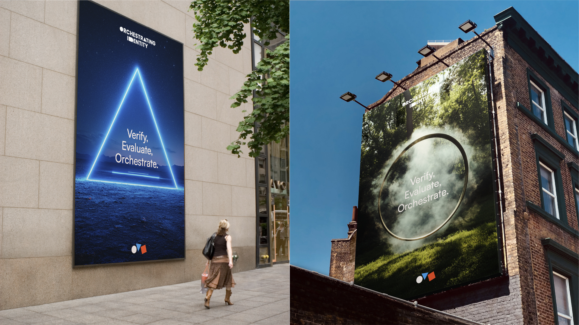
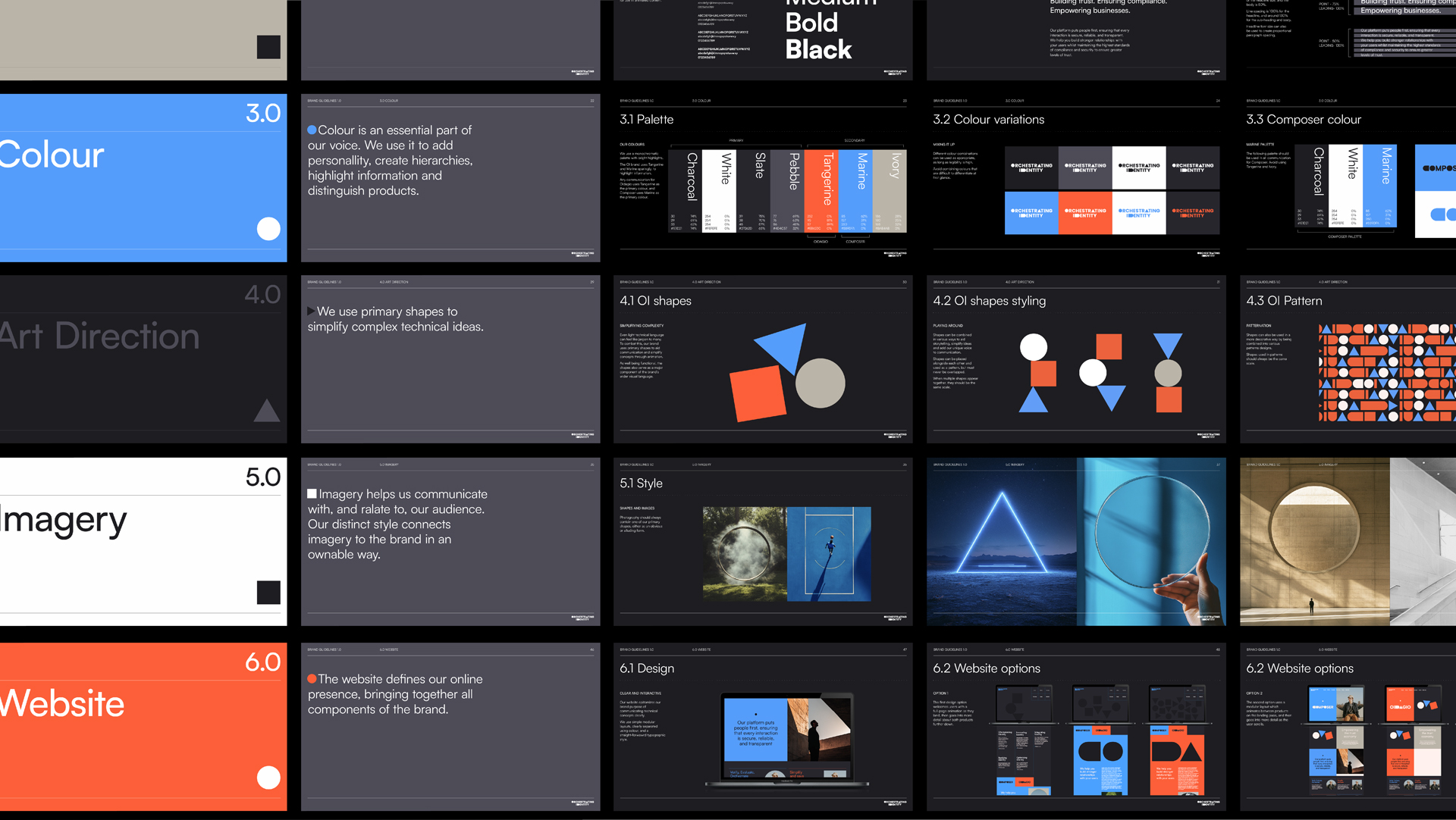
Our challenge was to move away from the cliché “man in a hoodie” tech aesthetic and instead build a brand that felt approachable, simple, and powerful. The creative direction centred on disruptive simplicity. so intuitive that even a child could understand it.
The concept drew from a universal metaphor: square pegs in square holes, round pegs in round holes. That clarity informed every element, from the logo and visual identity to communications strategy and tone of voice. The result was a brand that cuts through complexity and connects instantly.
Industry
Tech
Tech
Creative Direction
brandingbygarden
brandingbygarden
Expertise
Brand Exploration, Art Direction, Brand Guidelines, Visual Identity Design
Brand Exploration, Art Direction, Brand Guidelines, Visual Identity Design
Year
2024
2024